Visual hierarchy was doing too much at once.
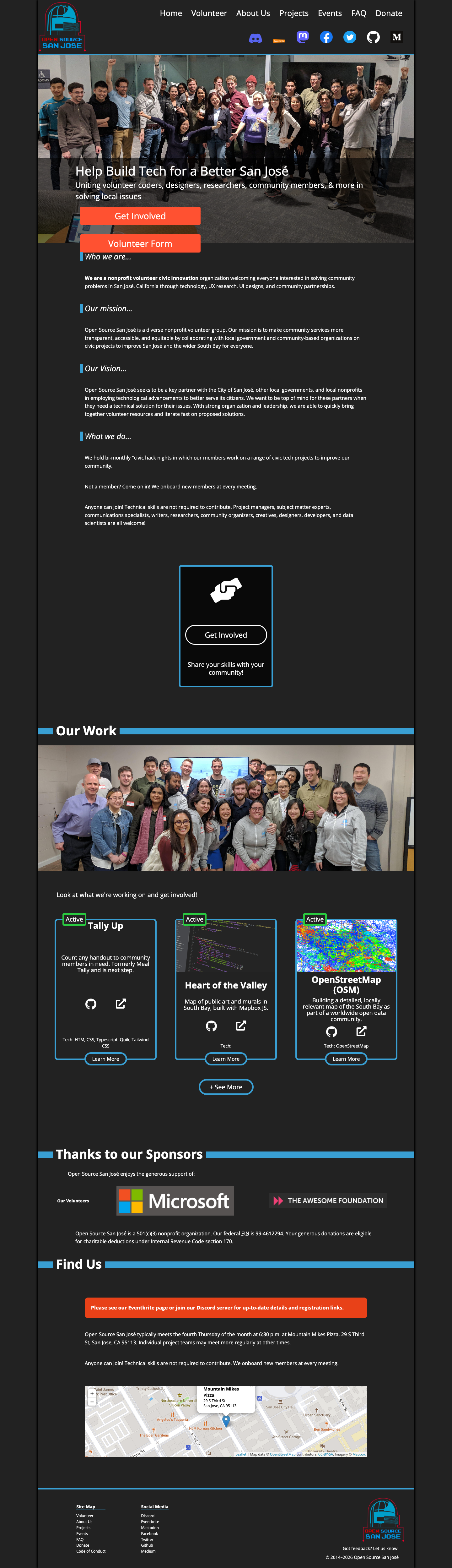
The page included mission text, volunteer CTAs, project cards, sponsors, and location details, but many sections used similar weight and spacing, so the reading path felt less controlled.
Context / brief
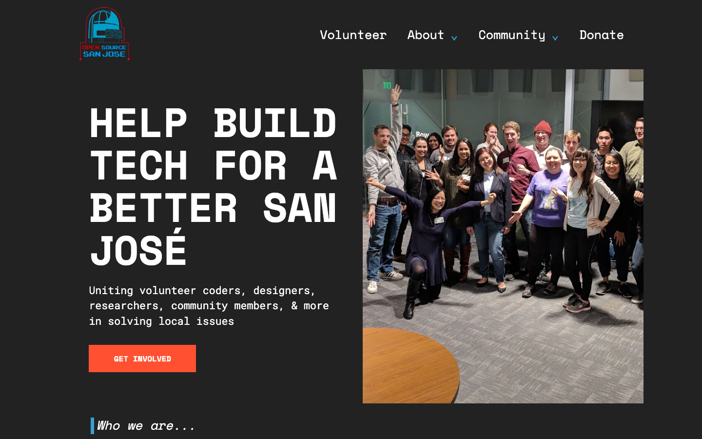
For the BizzNEST Design Associate assessment, I chose Option 2: evaluate the current Open Source San José homepage and create a high-fidelity redesign. The deliverables included a written audit, a redesigned homepage direction, and a short rationale explaining the design choices.
The original site already had the right foundation: a strong mission, civic-tech purpose, volunteer information, project work, sponsors, and meeting details. My goal was to preserve that identity while making the page feel more polished, easier to scan, and more intentional.
Audit findings
The page included mission text, volunteer CTAs, project cards, sponsors, and location details, but many sections used similar weight and spacing, so the reading path felt less controlled.
The original hero had multiple actions close together. I wanted the redesign to make the main get-involved path feel more deliberate while still keeping donation and community links available.
The original site had valuable paragraphs about the organization’s mission and work, but tighter spacing and smaller text made those sections feel dense.
Because Open Source San José is a software and civic-tech organization, I wanted the redesign to keep the existing dark, blue, and red brand cues while making the typography and layout feel more technical.

Design priorities
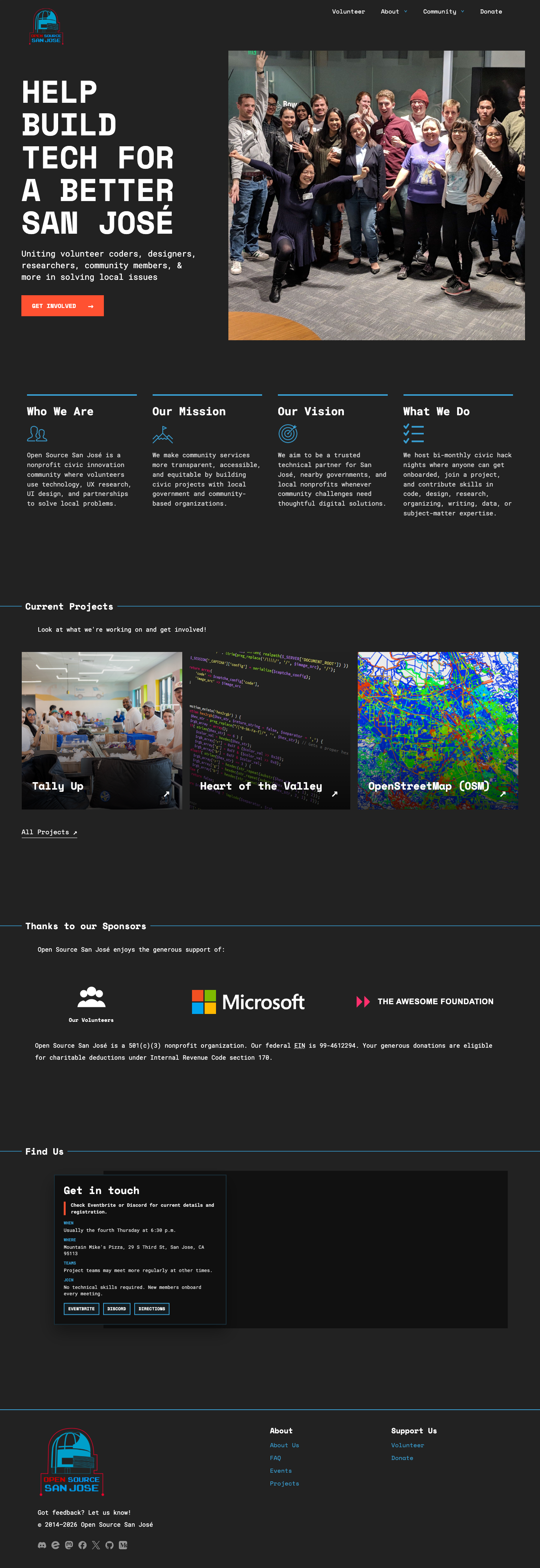
Carry forward the dark background, bright blue accents, red CTA color, and community photography from the original site.
Use a code-inspired type direction and sharper spacing so the page immediately gives software-organization cues.
Keep the original mission, project, sponsor, and meeting information, but reorganize it into clearer chunks.
Make volunteering, community details, and donation paths easier to understand without overloading the hero.
User flow
Lead with a direct statement about building technology for a better San José.
Break Who We Are, Mission, Vision, and What We Do into a tighter row of digestible content blocks.
Give project work more visual presence so the organization’s software output feels concrete.
Keep sponsors and community proof visible, but give them a calmer section layout.
Move visitors toward Eventbrite, Discord, directions, volunteering, or donation after the core story is clear.
Before / after
Responsive design

Build details
The project was implemented with HTML, CSS, and JavaScript and deployed through GitHub Pages. I built the page around responsive layout, readable hierarchy, accessible navigation, and a visual system that fits the organization’s tech-focused identity.
The final build includes an animated code-rain treatment, mobile menu behavior, dropdown navigation, reduced-motion support, and redesigned sections for projects, sponsors, community context, location, and footer content.
Outcome / reflection